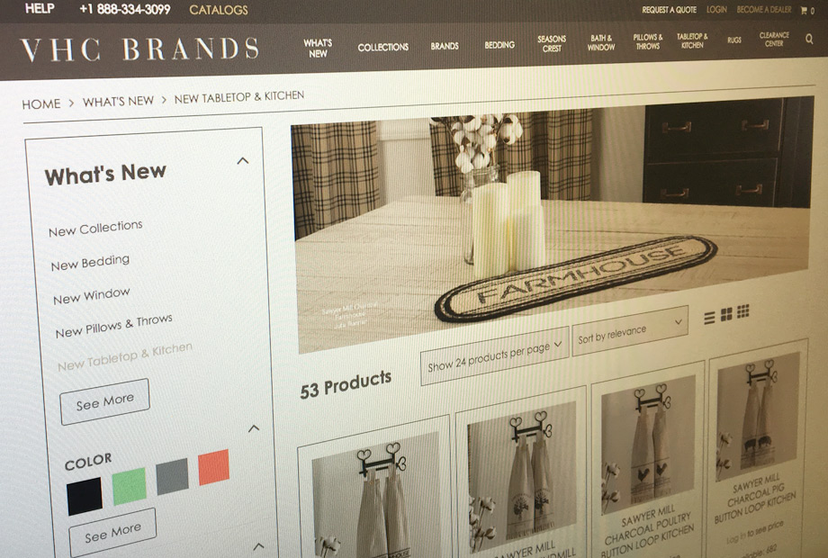
There has been a buzz about B2B websites in the latest years and the differences with B2C sites. The first obvious difference is the target audience they aim to sell to. Some time ago, there was also a misconception that B2C sites should look “prettier” that B2B sites, but the case is this tends to be a false assumption, even so that the concept of B2H, Business to Human, was created.
So what makes a website good for B2B? It will be a simplistic way to tackle this, answering that it is functionality specific for B2B that makes a website good for B2B but lets dig deeper.
B2B shoppers means more repeated customers
Generally B2B websites receive a large portion of orders from repeated buyers. That’s mainly because, unlike end consumers, the nature of companies is to look for the right vendor and establish a long lasting business relationship. In this sense, companies tend to repeat their orders with vendors, so making sure vendors websites cater them in a way that helps their shopping experience is key. There are certain functionalities that will help accomplish this.
Quick Ordering
Think how to streamline order placing. For example, “Quick Order Forms” so your repeated customers can easily add a long list of items only by typing the SKU number or the name of the product (avoiding exploring your catalog). In this last case predictive type search comes very handy too. You can further enhance a quick order form functionality with the ability to upload a CSV file. “Reorders” allow your customers to effortlessly repeat a past order or previously purchased item.
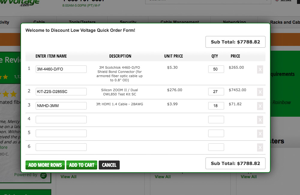
Credits: Discount Low Voltage
In some cases where shoppers buy the same product on regular intervals of time, you may consider adding a product subscription feature so auto-reorder of specific items are enabled and shipped their way weekly, monthly, quarterly or yearly.
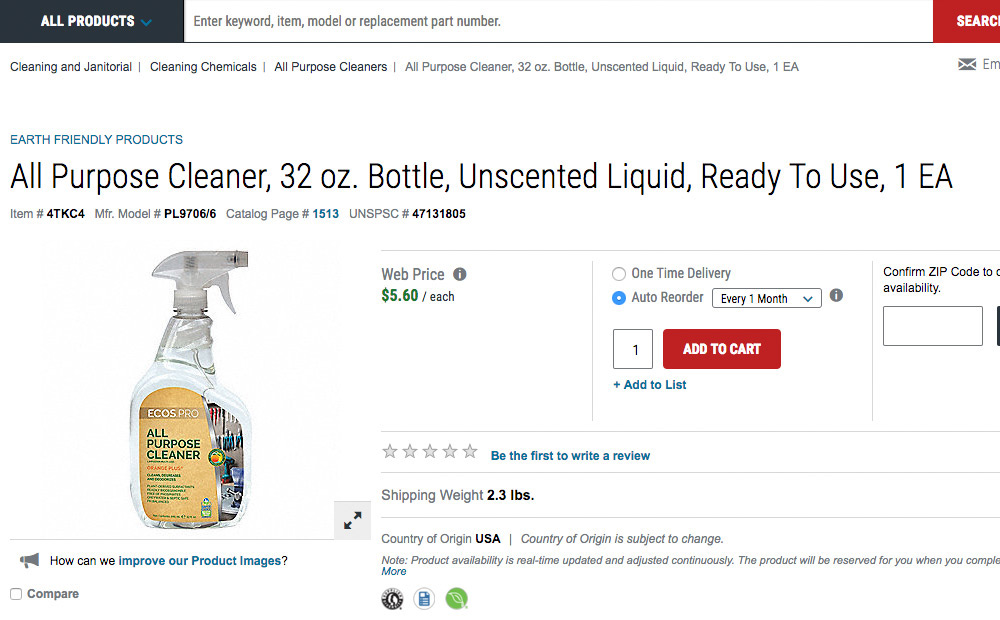
Credits: Grainger
Quotes
B2B customers might need quotes before ordering from you. In many cases it’s just part of the ordinary procurement process where one quote can go through different stages. Managing this online through the My Account section can facilitate the buying process and generate more efficiencies from your side.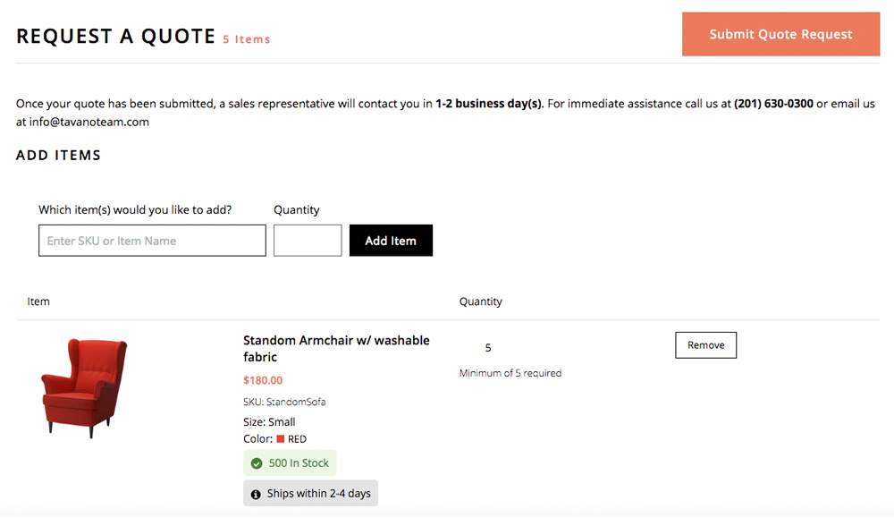
As offline but better
Your site should allow your B2B customers to allow credit and credit limits, pay invoices in full or partially and manage their own account with you. You should be able to enable associated terms for your customers. If customers feel they are limited in the way they do business with you, they might buy less from you, or even go with your competitor. So provide all of the financial and payment option you do in an offline word.
Negotiated and Quantity Pricing
Most sure you negotiated pricing levels on the offline world based on the customer type. Now, that agreement needs to be reflected on your site.
Provide quantity discounts with tiered pricing, to encourage AOV increase. You can further push this, by applying special shipping prices for orders over X amount of money. You should also be able to establish minimum order quantities.
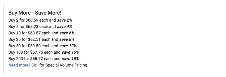
Credits: POS Supply Solutions
Performance
We all live busy lives, and when it comes to work there is no time to wait for a low performant site. Keep it up to date, optimize it at least twice a year and keep an eye on site speed and bounce rates. You need to make it fast and easy for your customer to buy from you.
Stock visibility
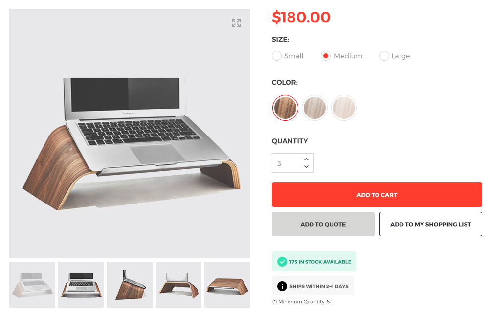
Let your customers know the stock levels of your inventory. Your customers should know if an item ordered will be fulfilled immediately or will be back ordered.
Mobile and SEO Friendly
Every now and then, we hear from a prospect saying their want a new B2B website, but are not worried on how mobile friendly it is, or whether it’s good for SEO…?. If you are building a password protected B2B website, we can understand that SEO is not important, however in almost all cases mobile friendly is… and a lot.

