Smart UX writing effectively improves the user experience, but it can hurt your brand if it’s not well-intentioned. Some merchants are embracing Dark Patterns to manipulate users, knowingly and intentionally. Even giants like Facebook, Amazon, Microsoft, and Google use them! Here’s why you shouldn’t.
Consumers are demanding change now more than ever. If they’re unhappy, they will act on it. Accenture’s global survey of more than 30,000 consumers found that 37% of them are ready to walk away from brands in frustration. A whopping 25% of them will never consider returning once they left.
“A dark pattern is a deceptive piece of
interface design, designed to trick users into
doing things they wouldn’t normally do.”
Consumers expect companies to be relevant, useful, and entertaining. Yet, at the same time, they have to be authentic, real, and ethical. It’s not impossible, but it IS incompatible with the short-term goal culture that most companies have.
The switch from product to customer-centric communication is accelerating. Sometimes, however, companies too eager to attract customers in innovative ways end up obtaining the complete opposite effect, alienating them.
“Dark patterns can be subtle,
but they can also be overly aggressive.
They can be the unintentional result of bad design.”
Dark patterns are deceptive interface designs created to trick users into doing things they wouldn’t normally do. They often employ visual tricks and psychological techniques in their presentation to fool unwary consumers. Harry Brignull coined the term in 2010, and since then, he’s been investigating and registering uses of dark patterns in darkpatterns.org.
These are the 12 most common types of Dark Patterns:
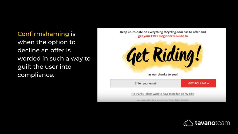
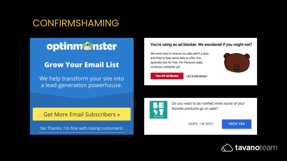
Confirmshaming
When the option to decline an offer is worded in such a way as to guilt the user into compliance, you’ve probably seen messages like these all around. Some are more aggressive than others. But the truth is that they’re pretty commonplace right now.
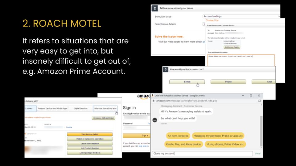
Roach Motel
It refers to situations that are very easy to get into but insanely difficult to get out. Take, for example, how difficult it is to close an Amazon Prime account!
Price Comparison Prevention
Where retailers make it hard to make an informed decision by preventing from comparing prices, they hide information, they don’t publish their prices, or they have too many options or plans, but it’s not clear what each one includes.
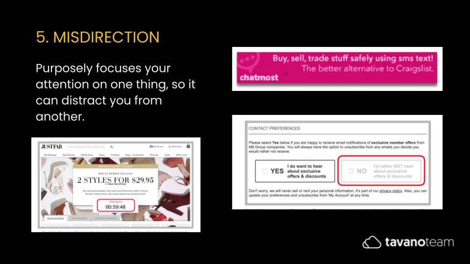
Misdirection
When a website tries to focus your attention on one thing, so it can distract you from another.
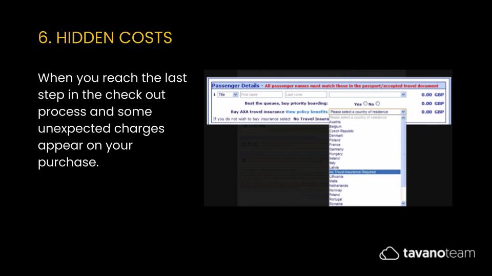
Hidden Costs
Pretty self-explanatory. It’s when you reach the last step in the check-out process, and some unexpected charges appear on your purchase. Think of Airbnb and its services fees or cleaning fees, for example.
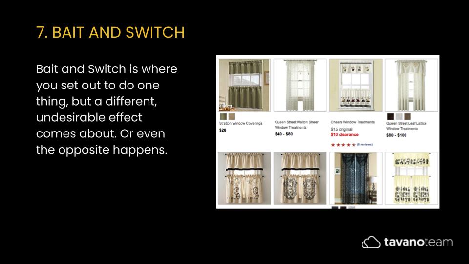
Bait and Switch
Where you set out to do one thing, but a different, undesirable effect comes about. Think of Microsoft when they started offering the update to Windows 10. They changed the purpose of the X in the top right corner—usually meant to close the window—to mean, “Yes, I want to switch to Windows 10.
Disguised Ads
Also pretty straightforward. They appear to be other pieces of content or navigation features that trick you into clicking on them. Think of streaming sites with endless download buttons that are links to other pages.
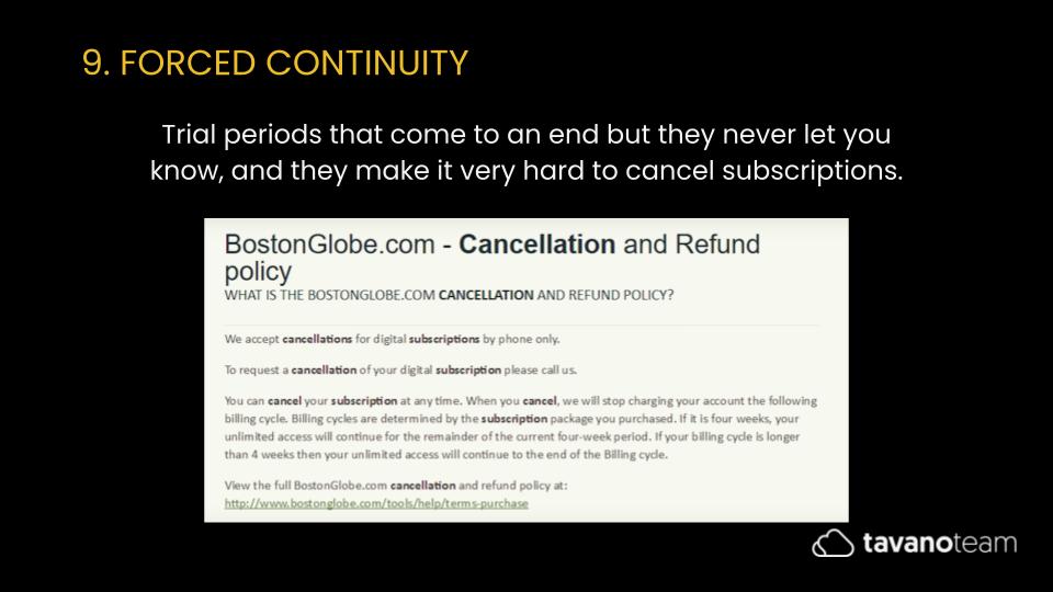
Forced Continuity
When trial periods come to an end, but the company never lets you know, making it very hard to cancel subscriptions — usually used in combination with Disguised Ads and Roach Motel.
Friend Spam
Where a company gets access to your contacts list and spams them on your behalf (without your or their consent), in 2015, LinkedIn had to pay $13M in damages for sending spam to unsuspecting contacts!
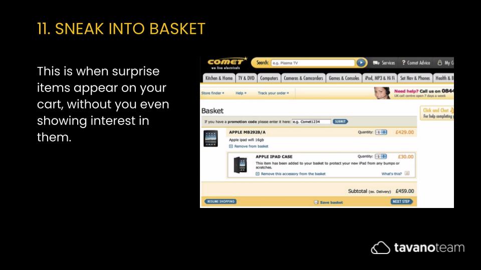
Sneak Into Basket
Surprise items appear on your cart even if you’ve never shown interest in them. Highly unethical.
Privacy Zuckering*
Where you’re tricked into publicly sharing more information than you wanted to in the first place, usually hidden inside the terms and conditions, so it’s almost undetectable. Probably the most dangerous dark pattern for users.
*Real name, no kidding.
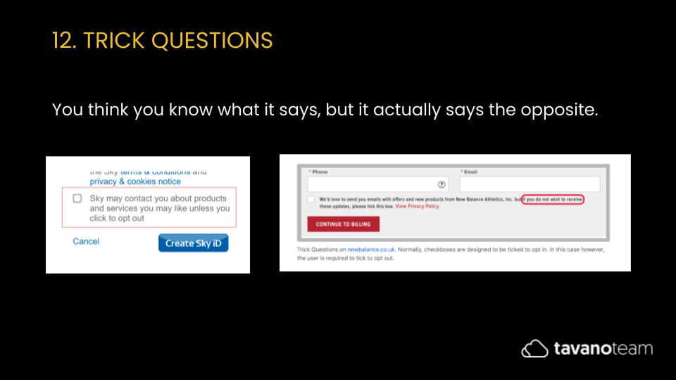
Trick Questions
You think you know what it says, but it actually says the opposite! They use multiple negatives with redundancy and purposefully ambiguous text.
Dark patterns can be subtle, but they can also be overly aggressive. They can be the unintentional result of bad design. Alternatively, companies can explicitly create them to trick consumers and corner them into making decisions out of their usual journeys. But the question is, how far is too far?
Some Examples of Dark Patterns
So, how Do Dark Patterns Work?
It’s so simple; it’s scary. Website and app users don’t often read every word on a page. When they skim or make assumptions, it’s pretty easy to trick them with simple elements like color changes or confusing language.
In June 2019, academics and politicians started meeting at the US Capitol to discuss dark patterns. It’s illegal for US companies to deceive shoppers, but dark patterns enter a gray area because they are more subtle. The hope is that soon there will be a new bill regulating these practices.
Researchers at Princeton University investigated over 10,000 sites. They found more than 1,200 eCommerce websites that manipulate customers using fake customer testimonials, shaming customers who try to leave, and running a meaningless countdown clock.
The 4 Reasons to stop using dark Patterns in eCommerce
We should steer clear of dark patterns in eCommerce websites and the potential vicious cycle they can create. They’re a thing of the past. Sites that use dark patterns are out of touch with the reality of what consumers look for in a brand.
1. They violate customer trust
Let’s face it. For shoppers, your site’s security isn’t measured by the quality of your infrastructure but by your integrity. Dark patterns leave consumers feeling frustrated and betrayed.
Deceptive advertising has a high potential to destroy the relationships you’ve built with your customers, which means they won’t do business with you again. Users are not dumb. Once they realize what you did, it will take you a lot of effort to gain their trust back.
2. They hurt your reputation
A dissatisfied customer is much more likely to leave a bad review than a satisfied customer a good one. If potential customers see too many negative reviews about your deceptive marketing practices, they will not buy from you. Your business’s health could take a hit, as well as your profitability.
3. They open up your customers to unexpected data breaches
With Cambridge Analytica and numerous social media data breaches, the average consumer is now much more focused on protecting their data online. If world banking institutions aren’t safe from hackers, neither is your eCommerce business.
By dishonestly soliciting information from your customers, you open them up to data theft without their knowledge, preventing them from being proactive participants in their digital footprint.
4. They create a dishonest corporate culture
Employing deceptive advertising practices on your site also affects your employees. If employees see that you are willing to use dishonest business practices to drive profits, they may follow suit. Dark patterns can create a culture of deceptiveness at your company, opening you up to rot from the inside.
In conclusion
It’s one thing to be informal. It’s another to be sneaky. And while companies might benefit from dark patterns in very short-term periods, their businesses become less and less sustainable. It becomes a vicious cycle.
You can’t design reliability. But honest design can help build it. So please don’t use copy and UX design to scare, confuse, or mislead users. Make sure your copies are authentic, transparent, brand-specific, and fit into the context. To learn more about UX writing and how to prevent dark patterns in your SuiteCommerce business, contact us!
Also, make sure to follow us on Instagram, Facebook, and Twitter for the latest news and tips on SuiteCommerce.


