A website form can be an easy experience for the user or a frustrating one. Easy ones turn into completed forms with fewer errors, leaving users more satisfied. On the other hand confusing, long or clarity lacking ones can lead into frustration, abandonment and an overall bad user experience.
Following are a few guidelines to help you optimize your webforms.
Keep it simple, keep it short.
Don’t ask for more information than is necessary. If a form is too long and complicated, it will scare people away. Every single field you ask a user to fill out increases the risk of desertion, errors or distraction.
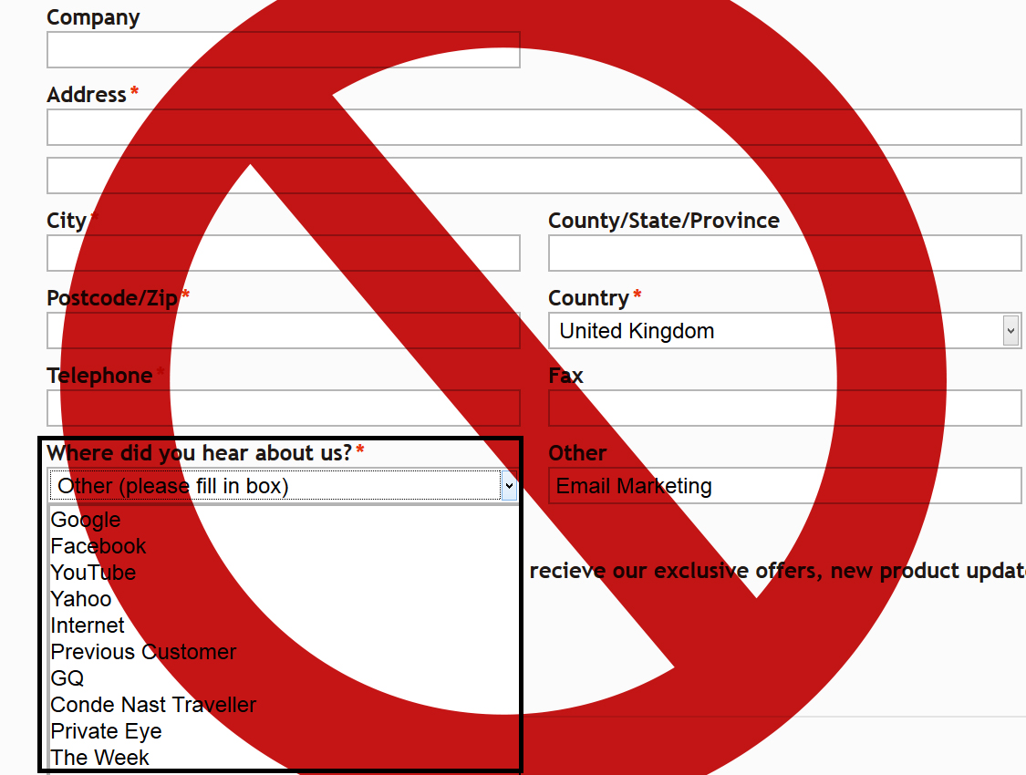
A typical example of an unnecessary question is “Where did you hear from us?”. This question is not just expendable but is also obsolete with nowadays analytics and customer data sources.
If a form has to be long, break it up into logically grouped segments so it’s less intimidating. Pagination of those steps is preferred by users.
Identify optional and required fields.
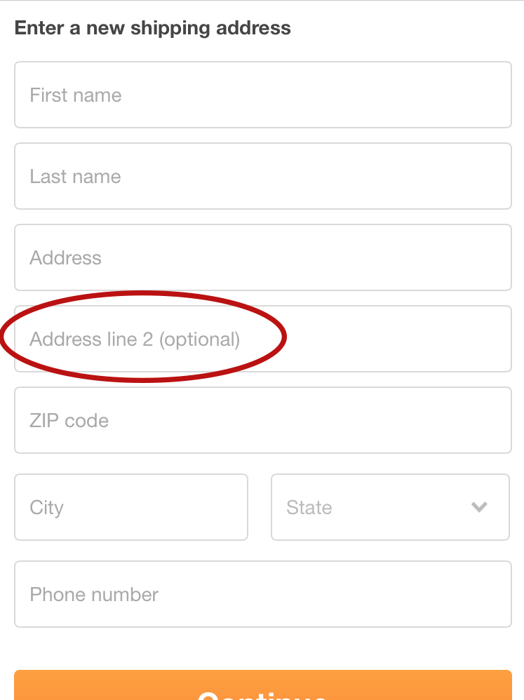
As exposed above, get rid of as many fields as you can, if its not necessary information you shouldn’t even ask for it, not even as optional questions. If by any case you need to apply certain fields to a subcategory or subgroup of users or situations like the below image, where an optional field needs to be applied, make it clear that filling out those fields is not required.

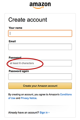
If information has to be in a particular format, explain and give an example. Don’t let the instructions overwhelm the form, though. Give clear and concise instructions.
Use a single-column format.
It’s easier for users to navigate through and adapts better to mobile devices. Each field should have the label next to it. Closely grouped fields, such as city, state, and zip can be in one row.
Match the field size to the expected data size.
Give users enough space to enter a long street or city name. Fields with fixed size data, such as phone numbers, can be just long enough for the required size, as it can be frustrating to see the data you just imputed visually cut off, where you cannot verify at a glance if its correct. On another note, try to avoid dropdown menus for few options (2 or 3) go for radio buttons in these scenarios.
Give instructions and catch errors during entry.
It’s frustrating to fill out a form, submit it, and then be told you made a mistake. If the form doesn’t accept keystrokes that are wrong (e.g. dollar signs in a strictly numeric field) and doesn’t let users submit it till everything is right, it’s easier for the user. Avoid users making errors with clear instructions on the fields.
Provide user shortcuts.
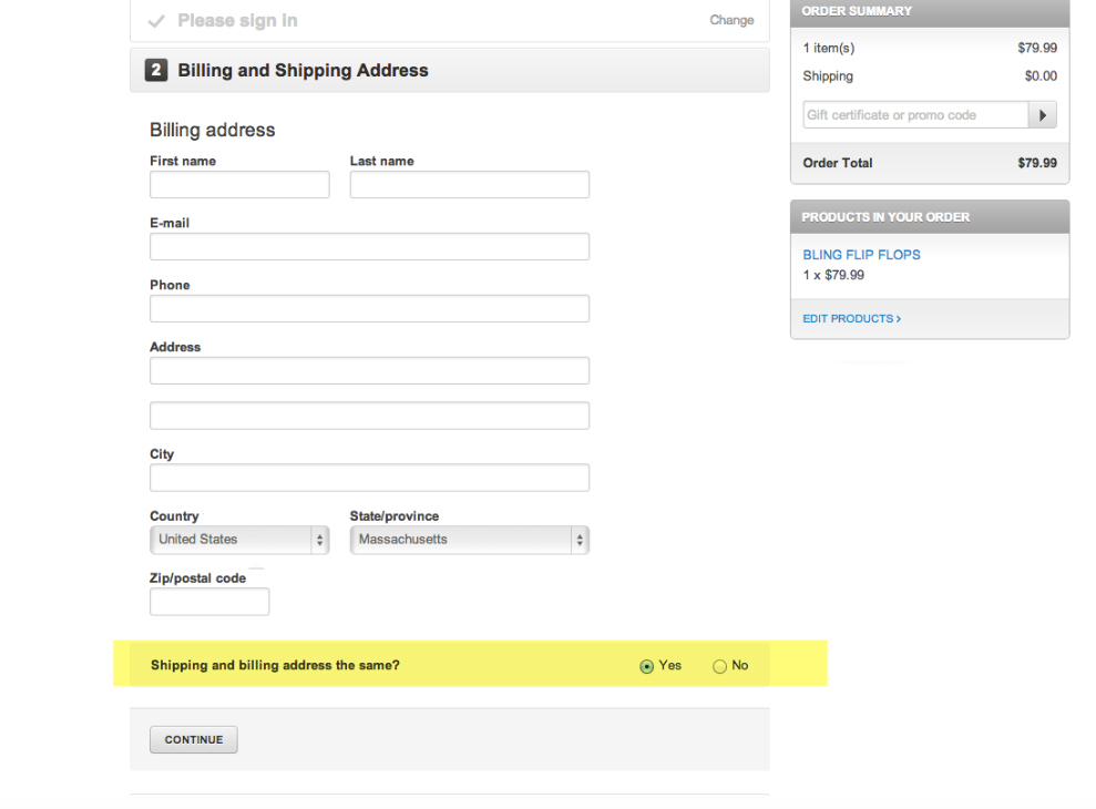
If a form includes a date field, a calendar widget makes the user’s job easier. If it includes a billing and a shipping address, users will love a checkbox to say they’re the same.
We can help you to build the most effective business websites and digital marketing campaigns. Contact us to learn more.


