There are some easy web accessibility tips you can use at any time, let’s go through them! Sometimes designers overlook web accessibility practices because they either favor form over function or simply because they do not know they exist.
However, a knowledgeable developer understands that some adjustments are necessary to make the site more accessible for the elderly and people with visual, hearing, or cognitive disabilities.
If we’re 100% pragmatic in our thinking, there are two reasons why websites should be accessible. As we mentioned in our previous post, Web Accessibility Lawsuits Are Growing Exponentially – Are You Prepared?, 1 in 4 adult Americans has some type of disability. Meaning: An accessible website could help in getting more customers—and loyal ones at that. The second reason is to avoid being on the receiving end of an ADA Lawsuit, of course.
If we’re 100% idealistic, we would say the main reason to make your website accessible is to help people. You will help people with disabilities do the same tasks online, like everybody else.
So whatever your reasons, we figured you’d appreciate some web accessibility tips for your website.
1 Pick a Content Management System that Supports Web Accessibility
Today’s open-source CMSs are adaptable enough to meet web accessibility demands. WordPress, for instance, is well-prepared for accessibility tasks. But its competitors, like Drupal and Joomla, are up to the task. Of course, if you’re running your business on NetSuite, you’re safe as well.
2 Use headings correctly to organize the structure of your content.
Screen readers use heading structure to navigate content. When you use headings (<h1>, <h2>, and so on) correctly, your content is well-organized and interpreted by screen readers with ease.
Do not pick a header based on looks only; instead, create a new CSS class to style your text.
Examples of proper use of headings:
- Use <h1> for the title of the page only. Avoid using <h1> for anything other than the title.
- Use headings to indicate and organize your content structure.
- Do not skip heading levels (e.g., go from a <h1> to an <h3>), as users will wonder if some content is missing.
3 Ensure The Website is Keyboard-Friendly
This feature is crucial! For a site to be accessible, users must be able to navigate through it with a keyboard only without a problem. The reason for this is because most assistive technologies depend on keyboard-only navigation.
With this in mind, shoppers must be able to access all functionalities on your website through a keyboard. This involves accessing all content, pages, links, etc.
Place relevant hyperlinks and interactive elements higher up the web page! Make the exercise of counting how many times you need to hit the Tab key to get to them. Ask yourself: Did you get to it fast enough?
4 Include Alt Text to Images
Alt Text behaves as a substitute for any image that fails to load. Typically, the Alt Text defines an image or gives users context. Besides, it’s good for SEO! The good thing about using Alt Text is that visually impaired persons can read the image’s content via screen readers.
5 Pick Colors Wisely
Designers and website owners are easily fascinated with bright layouts. It’s usually advisable to avoid bright colors, though. High intensity is particularly bothersome for users with high photosensitivity. It also reduces readability for all users, so it’s not very friendly. Make sure to use a distinct contrast to make the content readable for the color-blind.
6 Enable Resizable Text
Most web browsers allow users to resize text, and this will be beneficial to those with visual difficulties. But, resizing text can make it hard to interact with your site or break its design if you fail to design the website to support this functionality.
The best practice is to avoid using absolute units. As an alternative, you should use relative sizes as they allow the site’s text to scale depending on the screen size and content.
7 Use an Automated Web Accessibility Solution
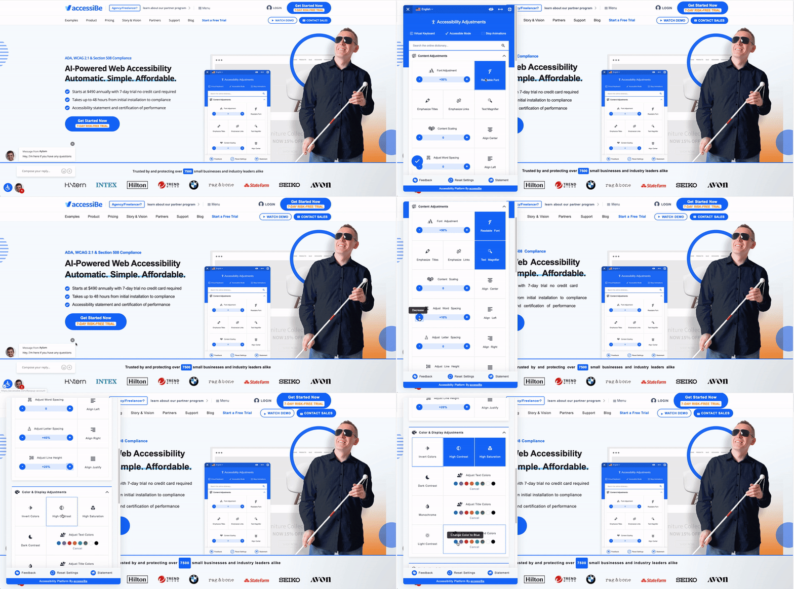
If you’re not a developer and if you don’t have time to waste, there is a quick solution. The easiest way to make your website accessible in no time is to invest in automated web accessibility technology.
There are quite a few companies out there offering this service. AccessiBe is one of them, and it’s the only solution that ensures full accessibility compliance with WCAG 2.1, ADA, Section 508, AODA, EN 301549, and IS 5568.
Watch AccessiBe in action!

At Tavano Team, our goal is to empower merchants and shoppers alike. If you wish to learn more web accessibility tips, about AccessiBe and how it can help your website, send us a message!


