When it comes to selling online to organizations (not individuals) there are many factors to take into consideration that play an important role in shopper experience and matching their expectations. Building a good B2B website takes a deep understanding of the company’s business model, their shoppers needs and their expectations when arriving to a web store.
We reviewed some of the most important B2B online sellers in the market and looked at how they are catering their B2B audience, what are they doing differently from their competitors, and which features are worth sharing to our B2B online sellers readers.
Create Lists and Receive Reminders
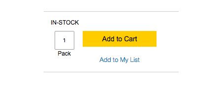
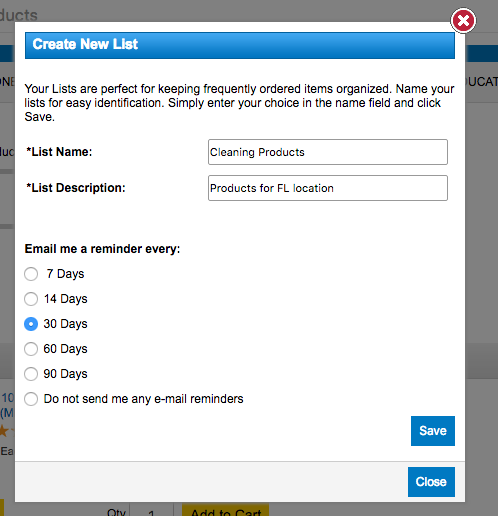
Allowing registered shoppers to create and save their own product lists helps frequent shoppers have products organized and facilitate generating new orders.
Extract even more value out of this feature by sending “My List” reminders to shoppers with saved lists. Quill.com asks their shoppers how and when they would like to be reminded about their new created lists.
Saved for Later
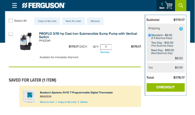
Another good reminder tool, Saved for Later, it’s an easy to implement feature and can help increase average order value. As displayed in Ferguson.com, this upsell section is located at the shopping cart page displaying Saved for Later items below the cart reminding shopper of items they liked in the past and decided to act on later.
In NetSuite SuiteCommerce Advanced this is a standard and easy to implement feature.
Quick Order
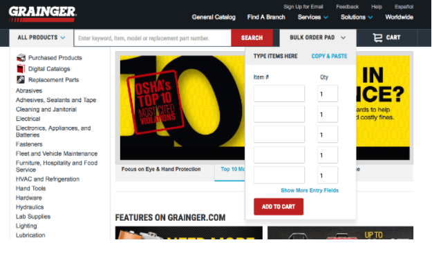
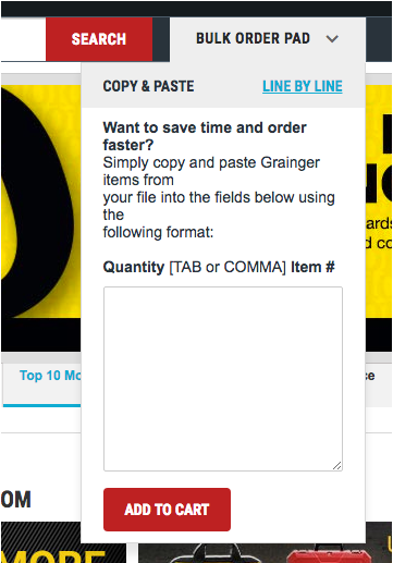
For your frequent shoppers a Quick Order form helps the order entering process. Instead of browsing through product pages and adding each product to the cart, shoppers can quickly enter the item # and quantities within one same form and instantly add all products to cart.
What’s interesting of Grainger.com example is that they have added an alternative way of using the Quick Order form or Bulk Order form (as they call it) by letting shoppers to copy and paste quantity and item # in a text format.
Availability Check at Product Page
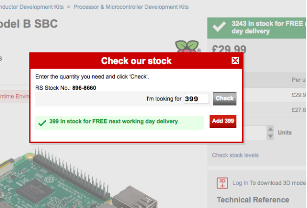
For online sellers not accepting backorders this feature helps both sellers and buyers providing full stock visibility before adding items to the cart. B2B online retailer RS Components does it very well with “check stock levels” link below the add to cart button.
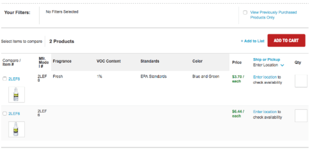
Here’s another example from Grainer where shoppers need to enter Location to check availability (if pickup).
Please note, on the top right hand corner the “View Previously Purchased Products Only” checkbox. This is not related to this section topic, but it’s worth highlight it as a great filtered navigation option as shopper browse your product catalog.
Verify ETA at Product Page
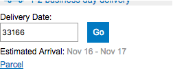
Quill.com adds another UX enhancement by adding information for shoppers which will help match their shipping arrival expectations. As an example they’ve added a small section right below the add-to-cart button so shoppers can verify when that item could be shipped based on shopper’s zip code.
It’s important to highlight, that this input field it’s not located at the shopping cart page, but one step before at the product detail page.
Easy and Intuitive Bulk Add to Cart
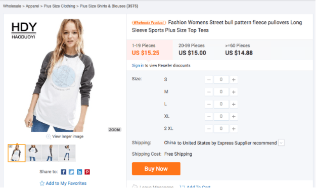
What’s great about this next example of Alibaba.com, is that not only it’s a great example of how to provide users with an intuitive bulk add-to-cart process choosing different quantities for multiple sizes (product options), but at the same time quantity discount pricing is integrated to the process together with Price Levels!
Present Subscriptions as Upsell
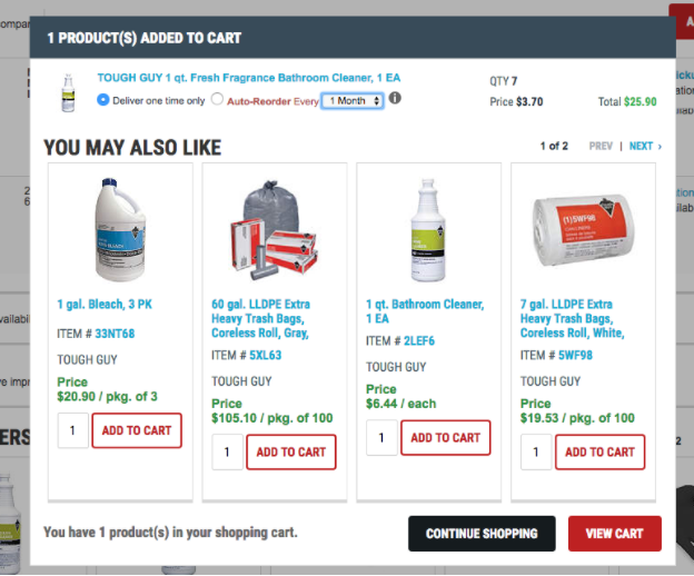
Recently we published an article about the benefits for online sellers by offering subscription model and how to implement in NetSuite. In this case B2B seller Grainer.com provides shoppers with the option of enabling “auto re-order” right after hitting add-to-cart – this right in the add-to-cart confirmation lightbox screen.
Get Actionable Data From Registration
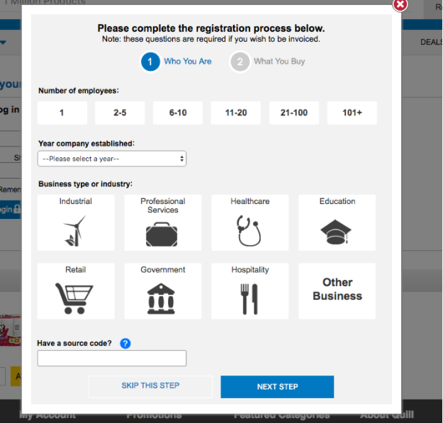
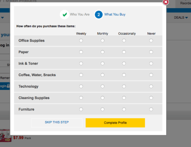
Back to Quill.com, I went through their registration process and was amazed about how much information they are asking, but at the same time, how easy and simple the process was. For B2B online sellers, understanding actual needs of individual customer it’s a giant step closer to generating a new frequent buyer (or repeated customer).
In this case, I believe the trick is in the use of images instead of text options.


