Creating an effective call-to-action is a whole science in and of itself! Whether your goal is to have visitors join your email list, check out product testimonials, or shine some light on a new release, these four successful tips will allow you to create compelling CTAs your customers won’t resist!
We first need to understand what a Call-To-Action (CTA) is. We can define it as an “element” or “tool” marketers, and eCommerce managers use to guide users towards an action, which ultimately leads to a conversion (micro or macro conversion).
Most of the time, CTAs are buttons (with different shapes, text, sizes, and colors), but as a matter of fact, any element in your page where users can click is a call-to-action. For the sake of this article, we will only refer to the first option, buttons.
It’s this simple – a page with a strong CTA button will generate more conversions than one with a weak one. They are the gateway to increasing your eCommerce conversions! To really *get* CTAs, all you need is to understand what your target audience wants and how badly they want it.
Read on!
1. CTAs Must Be Relevant: AKA, compelling and short
CTA copy needs to be relevant to the message (offer) you are trying to convey on your web page. Relevancy is referred to the wording (“Learn More,” “Add To Cart,” “Buy,” “Continue,” “Join,” etc.…) used in CTA, which needs to be relevant to the conversion scenario that the shoppers are in.
For better conversion, there’s a “Rule of One” that establishes the need to add just one purpose, one point of focus, and one CTA per webpage.
Understanding this rule will help you identify where and how to draw your customers attention and will make it easier to craft relevant CTAs.
Choosing an appropriate word and font color will increase its impact. Using power words is always a good option, as it will increase the likelihood of people clicking on it. Choose words that convert!
When people get to your button, they need to switch from a reading mood to a ready-to-act mood. Make the CTA short so that they won’t wander to other pages! And don’t forget that what matters most is making it relevant to *your* audience.
2. Placement is Key: Place your buttons where people *actually* click
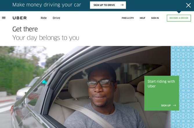
Where you place your CTA buttons will determine how many clicks they’ll get from visitors. Also, people’s eyes move at an impressive speed online. So make sure your users don’t need to search or figure out the next step to take. Present it to them thoughtfully and strategically. Images can help to draw attention to that section of the page.
Be aware of the information you place before, after, and around it. This information should give context and reasons for clicking the CTA.
Typically CTA placement is suggested to be above the fold. However, some factors may determine to place it somewhere else.
There are stages for educating, nurturing, and engaging your prospects that require a strategically placed CTA after providing critical information within the conversion funnel.
Simple products or services can have the buttons above the fold, but for more complex ones, it might be a good idea to place them after a certain amount of information that helps the user to make a timely decision. Remember – you should position your CTA button where it’ll influence the users’ decision-making process that is visiting your website.
Also, and very importantly – make sure the CTA buttons *look* clickable! Eliminate any distractions and have a clean and contrasting background to text color, with a distinct button text with a white space surrounding it. It’s always recommended for buttons to have a rectangular, sometimes rounded, shape, with a complementary border.
3. A First Person Tone is the go-to
A study shared by Unbounce informs that button texts set on a first-person tone (Get My Discount) got a staggering 90% increase in clicks over the ones written in the second person (Get Your Discount).
Try this tweak and measure the results – you’ll be surprised!
4. Test it out!
It’s always a good idea to test your CTA elements on usability, A/B, or multivariate testing — test colors, wording, placement, and design.
Look for adding a “sense of urgency”: the words “Now” and “Today” are widely used and have yielded promising results. Apply these options with the benefits of making click now or today:
Sign Up and Get 30% Off – Today Only
Buy Now for $40 $30
Urgency is a strong catalyst. After all, time is money. And if you save users their time by optimizing theirs, they’ll thank you.
There are different techniques that can add up to your CTAs optimization process. In one of our posts, we addressed many tips and tricks on using psychology to increase your conversions, applicable to CTAs. Check it out!
To learn how to leverage calls-to-action in your eCommerce, schedule a call with our experts!


