Imagine going to a brick and mortar department store. You ask if an item is in stock. The associate says, “nope!”, shrugs, and walks away without another word. Most likely, you’re going to leave the store right then and there.
Online variations on that very interaction happen constantly in the eCommerce space. When an item is out of stock, online storefronts are prone to everything from unceremoniously dropping users into an unhelpfully broad product category to a straight-up 404 type page that gives them zero leads.
There’s a better way. You likely managed to get that visitor landing on your out of stock product page through no small effort (smart SEO, having great word of mouth, traditional marketing). Don’t let them leave just because you can’t sell them the exact product they wanted!
Here are 3 ways to leverage your sold-out product pages to increase your overall revenue:
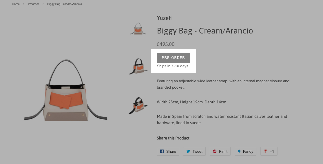
Note clearly that the item is sold out, while also prominently displaying the ability to pre-order the item right there. In many cases, visitors will become customers in that moment, before they back out to find what they’re looking for elsewhere. Dates for future stock are a great way to provide assurance that they’ll get the item they’re looking for on a concrete timetable.

Maybe you can’t convert every customer to a similar product or a pre-order right then and there. But there’s no harm in keeping them connected to your brand, getting a second chance at a conversion once you have the item ready for them to buy. For all our SuiteCommerce customers who required it, we have implemented our own bundle called “Back in Stock Notifications” and we are collecting lots of positive feedback from it.
Frankly, every product page should have some form of related items, as it gives the user the experience of browsing through your stock and keeps them engaged in your offerings, rather than simply treating your eCommerce presence as one of many places to buy a single distinct product. For sold-out pages, push your related items even more prominently in the layout.
The difference between a good and a great eCommerce retail experience is in encouraging your customers to view your storefront as a brand unto itself. Give them the feeling of a fully-featured shopping experience, not just a sparse digital storefront.
In an era where digital transformation drives competitive advantage, integrating artificial intelligence (AI) with NetSuite… Read More
And surely no one told you about. Enjoy the following lorem ipsum that I'm going… Read More
Upgrading your eCommerce UX is a great way to refresh your site without too much… Read More
Growth hacking? You read that right. Follow these tips and your eCommerce will soon be… Read More
Using FAQs to boost product sales is easier than you think! Use them to help… Read More